Beyond The Watch
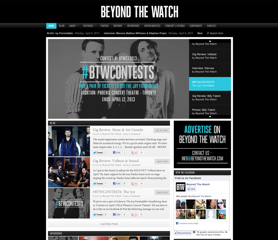
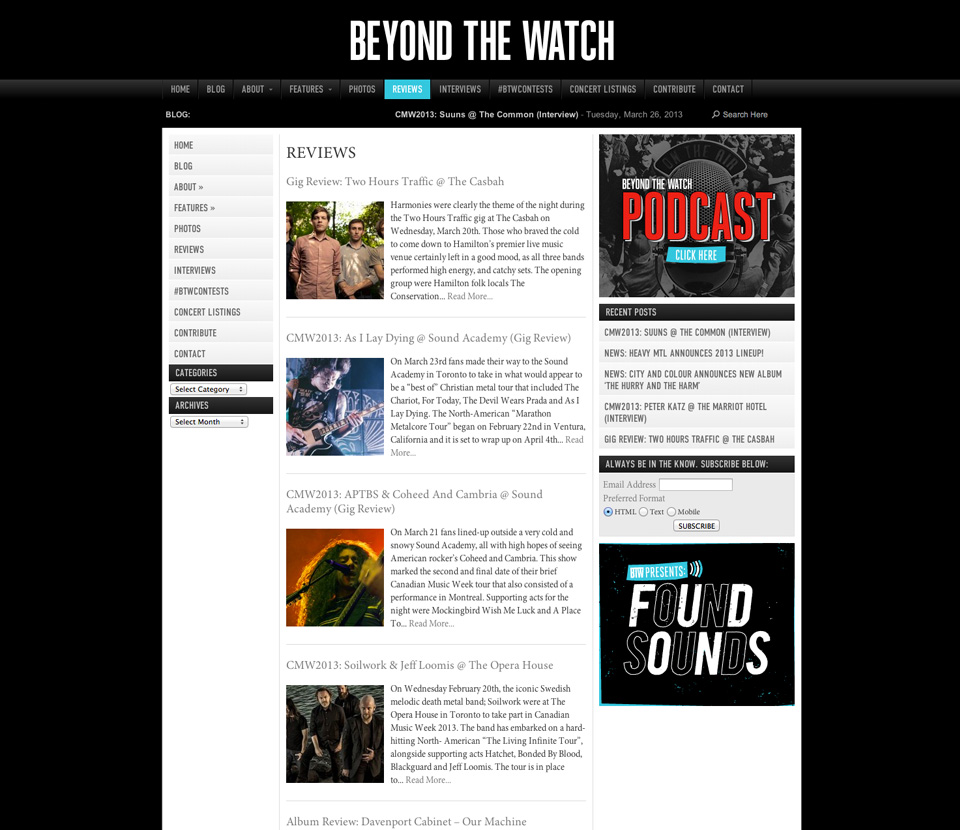
Using design cues from the client’s initial starting theme, we created a dark color palette with bright blue swatches the BTW’s new online presence. Vibrant blue colors showcase the sections of the theme that we want to draw attention to as well.